


What is Ridy?
Ridy is an online taxi booking application that has been developing innovative taxi order technology which makes the service more modern, accessible and safe. Our service helps thousands of people to save their money when making city trips and traveling.

Why Redesign?
The client approached me to redesign their rider and driver apps as the current design was outdated and not meeting the needs of their users. They had received feedback from their users that the app was difficult to navigate and lacked certain features. Additionally, with the increasing competition in the market, it was important for the client to stay ahead by providing a better user experience.
Project goals:
- Improve the overall user experience for both riders and drivers
- Increase user engagement and retention
- Create a modern and user-friendly design
- Add new features to differentiate from competitors

My role:
User Experience (UX)
& User Interface (UI)
Tools used:
Figma, Google docs, Excel, Miro, Google meet, google forms
Collaborations:
Front-End & back-end Developers
Project Duration:
6 months
Main tasks:
-
User research
-
Competitor analysis
-
User interviews
-
User flows
-
Sketching
-
Information Architecture
-
Wireframes
-
Visual design
-
Creating design system
-
Rapid Prototyping
-
A/B Testing
-
Usability Testing
User-centered Design Process
The design process carried out in this project is using the user-centered design (UCD) methodology.

Stage 1 -Empathize
Observation
I decided to do an in-depth analysis of the app first. I wanted to understand the functionalities, overall architecture, and navigation. By interacting with the application first, I can also create several scenarios for Usability Testing that will be carried out at a later stage. Through the analysis, I was able to identify some clear usability issues and pain points. I listed all of them to validate them after my User Research.
Driver app
Rider app

Ridy app old design
Research plan
Background
Based on user direct reviews, many users have complained about the user interface of the Ridy app. The problem that users complain about is that it is difficult to set the proper pick-up and drop-off point on map and also completing the booking process was not simple enough. Therefore, I wanted to evaluate the current user interface to find out the problems, then find solutions to these problems by creating a new user-centered design.
Objectives
1-Find out how the users behave while completing the ride booking process
2-Find out what pain points users face while interacting with different app features
3-Find out how users feel after completing main tasks in the app
Methodology:
-
Qualitative, In-depth interview
Sample specification:
-
Users who have used the Ridy app in the last month
-
Nationwide
-
Men/Women
-
Age: 18-50 y.o
Discussion guide:
Introduction: Hello, my name is Maryam Shahbazi.
Thank you for taking the time to help me do this research.
In this session, I will ask about your experience when completing different tasks in the Ridy application.
There is no right or wrong answer, you just need to explain to me how you think/feel.
This discussion is confidential, so feel free to answer based on what you think.
User profile: Please introduce yourself such as name, age, occupation, etc.
Behavior:
Can you explain to me what you usually do when you want to book a ride on the Ridy app?
Can you explain to me what you do when you want to complete payment for a ride in the app?
Can you explain to me what do you usually do when the app couldn't find a driver for your ride request?
User prospective of Ridy app:
How was your experience in booking a ride on the app?
How do you feel when you want to search for pick-up and drop-off point using the search route on the app?
What do you think of the choose taxi service page on the app?
What do you think of the waiting time for finding the driver on the app?
When you want to reserve a ride for future, what steps do you go through?
When you want to complete payment, what steps do you go through?
Conduct user research
Usability test of the old Ridy app:
Usability testing of the old design is to find out how users interact with the rider and driver application and to find out what pain points are felt by users. 6 users participated in this test as riders and 6 other users participated as drivers. This test is carried out remotely (Moderated) and uses Google Meet as a tool to interact with users. In this test, I have prepared 6 tasks for the rider app and 5 tasks for the driver app and used screen recording to analyze how they interact with the app and record important points when the user runs each task. Some of these tasks for the rider app are:
1. Navigate through the app and book a taxi from your current location to a nearby restaurant.
2. Use the app to book a taxi for a specific time in the future and verify that the booking is successfully scheduled.
3. Explore the app's interface and find information on how to contact customer support.
4. Input your pickup location as your saved gym address and your drop-off location as a specific address on the map
5. Add $8 credit to your Ridy wallet
6. Check the details of a past trip you had recently
Rider app testing result
In this test, I recorded the user’s time and success after running a task. The results of these tests noted that there was 1 task in the riders app that failed and got about 84 seconds. The task is to contact customer support, which the user cannot find the the contact support option and gives up looking for it. The results of usability testing of the old Ridy application can be seen in the table below.

In task number three, an error occurred when the user intends to contact support because the feature of contacting support is possible only in the travel options section and during the trip, while the user is looking for this feature in the app's side menu, from here I immediately recorded some insights from users when trying tasks in the old application design. Here are a some of the insights into what the users said and felt in an in-depth interview session after the usability test.
"I was trying to contact support, but I couldn't find the option anywhere in the side menu. It was frustrating!"
"I don't know how long it takes for the driver to reach the pick-up point so that I can coordinate my time."
"I want to pay in cash, but I cannot find an option for selecting cash in the payment methods so maybe cash payment is not available"
"Sometimes it takes so long for a driver to be found for my ride and I just keep canceling my request and sending it again."
Driver app testing result
In the driver test results, although all tasks were successfully completed, I received various feedback from drivers about unpleasant experiences while using the app during the post-usability test interview. For example, since drivers accept trips while behind the wheel, some of them accidentally press the accept button for a trip even though they didn't intend to accept it, and there is no option for drivers to cancel the trip, which causes concerns for them. Some of the drivers' comments about the app are as follows:
"Sometimes I want to accept a trip only on the way to my destination, but the app does not have this feature, which makes me use other apps."
Sometimes in a crowded area, after reaching the pick-up point and then traveling a distance, I see that I have not picked up the right passenger and someone else just got in the car to get a ride
"There are times that I only want to receive Ridy premium requests and I don't really want to scroll through all the regular requests to find the premium one among them "
"When I am tired and reviewing various requests, I accidentally accept one of them and there is nothing I can do except completing that trip."
Market research
In order to understand the current landscape of online taxi apps and identify areas of improvement I conducted a competitor analysis and researched the top players in the market with specific competitors that the customer had mentioned including Uber, Lyft, Free Now, and Bolt to gain insights into the user experience, user flows, features and overall performances.
Comparing payment flows of competitors

I decided to put together all my conclusions in Points of Difference (PoD) and Points of Parity (PoP). In a spreadsheet to show features that users expect to see because they have become a standard and it is necessary to include them in our application.
After that, I started thinking about what the new app can offer in contrast to competitors.
Competitor analyses


Key findings
This market research allowed me to understand market positioning and competitiveness of Ridy. I can say that the Uber app focuses on safety during the ride, Bolt has a lot of discounts and this application is associated with cheap taxi rides. Lft has many features — pet transportation, air conditioning and many others. other key findings are listed below:
-
Real-time tracking and transparent pricing are important for enhancing user trust and satisfaction.
-
Improving driver availability and accurate estimated fares can minimize user frustration.
-
Responsive customer support and a driver ratings system are crucial for a positive user experience.
-
There is potential to expand transportation services and payment options to cater to a wider audience.
What Ridy can offer in contrast to competitors
-
Using password to make sure the driver picks up the right passenger
-
Allow the driver to choose which services he wants to receive requests for
-
Showing the option to find a new driver when the user wants to cancel the ride after being matched with a driver
-
Option for people with disabilities — driver assistance, space for wheelchair, etc.;
-
“Share ride” option — user can share a ride with a friend and he will have access to data about the driver, car and user’s location;
-
Report issue option — user can report any issue during or after the ride to the support team.
Stage 2 -Define
User persona
The next step I did was to create a User Persona. I created user personas for both rider and driver from interviewed users after running usability testing. User personas are needed to describe potential users based on the research that has been done.
Rider persona

Driver persona

User Journey
From the user journey map, I can find out how users behave when they book a taxi with th application and what steps they go through. I can also find opportunities based on user pain points that are useful for design improvements.

Identifying the Problem
Based on the results of the analysis on usability testing and the user journey map, here are some of the main problems faced by users.
Rider problems
1-The lack of a visible support option in the side menu is causing frustration for users who need assistance, resulting in a poor user experience.
Solution:Placing the support button in the side menu and providing travel options based on user mental models, as well as adding the option to report issues through messages during or after the trip, can allow users to report issues without the need to contact customer support directly.
2-The inability to track the driver's estimated time of arrival is causing uncertainty and inconvenience for users trying to coordinate their time, negatively impacting the user experience.
Solution: Displaying an estimated time of arrival for the driver to reach the pickup location and the time it will take to reach the destination can help passengers plan their trip accordingly.
3-The absence of a clear option for cash payments is causing confusion for users who prefer this payment method.
Solution: Providing clear payment options, and asking the rider to select the desired payment method, including cash payments, before booking the ride can assure users that there will be no issues with this payment method in the app.
4-The extended wait times for finding a driver are causing frustration for users who have to repeatedly cancel and resend their ride requests, negatively impacting the user experience.
Solution: Displaying entertaining illustrations during the waiting time for a driver to arrive and showing alternative services that online drivers near the user's location are offering after a few seconds of waiting can help users start their trip faster by selecting other services.
5-The unresponsiveness of the screen when tapping or dragging left and right on the map is causing frustration for users.
Solution: Make it possible for the users who are willing to work with the map instead of tapping on the destination field to be able to set the pick-up and drop-off point directly by dragging and tapping on the map on the homepage
Driver problems
1-The lack of a filter for ride requests based on user preference is causing inconvenience and frustration for users who prefer premium requests over regular ones.
Solution: Allowing drivers to choose their preferred service types for receiving requests can streamline their workflow and make the app more personalized for them.
2-The inability to accurately identify the correct passenger during pick-up in crowded areas is leading to confusion and potential loss of earnings for drivers.
Solution: Implementing a password for each ride, which the passenger shares with the driver upon arrival, allows the driver to start the ride towards the destination only after entering the correct code in their app.
3-The absence of a feature that allows users to accept trips only on the way to their destination is forcing users to switch to other apps.
Solution: Having destination mode can attract more drivers and increase adoption of the app, even becoming a key feature in competing apps.
4-Accidentally accepting ride requests when reviewing them is causing inconvenience for users.
Solution: Adding a 3-second timer after the driver accepts a ride, during which the cancel button is active for the driver, allows them to quickly rectify any mistakes and cancel the ride if necessary.
Stage 3 -Ideate
At this stage, I create User Flow, Wireframe, Design System, and Mockup Design.
User flow

I created a User Flow to describe the steps the users will go through to book a taxi in the Ridy app
Card sorting
Considering the added features in the user profile section of the driver app, which includes enabling and disabling the services provided by the driver, various ways to withdraw earnings, and the ability to edit uploaded documents, I conducted open card sorting to examine how the information on the profile pages is organized from the users' perspective. The aim was to provide a better user experience by arranging the information based on the users' expectations.

Low-fi wireframing
I created lo-fi wireframes using Figma, based on the sketches that I’ve created before.

A/B testing
During presentation sessions and discussions with the employer, I realized that they want to make some changes to the trip requests display page for the drivers and show more details in a full-screen view. Then, to ensure the selection of the appropriate design, I conducted an A/B test (multi-variant testing)on this option.
A

B

After conducting the test, I realized that users spend more time scanning trip details in full-screen mode (B) and take longer to select a trip to start and press the accept trip button, while in the A version, they accept the trip faster and with more certainty by moving the map and checking the distance from the driver's location to the pick-up point. Therefore, the first version was chosen to be compatible with the driver's environmental conditions when accepting a trip, as the driver is behind the wheel and prefers to start the desired trip in less time.
Low-fi prototype testing
I asked 6 users to test my low-fi prototype. This test is carried out using a Figma prototype, and users are asked to run the prototype according to the tasks. During the interviews conducted after the test, I asked users about their thoughts on different elements and features, which led to changes in how some features were displayed.
I changed the placement of the destination mode feature as it was drawing more attention than necessary and causing users to assume they had to enter this mode by going online


Due to the presence of a bottom sheet modal, users were inclined to skip the survey, and most users had no interest in participating, quickly skipping the modal by tapping the space above it. Therefore, by making the design full-screen and increasing the distance between the close button and the touch point of the user's finger, users are more likely to provide feedback about their trip, providing valuable information for the service provider.

I changed the way the location selection feature on the map works because having this button separate from the fields was confusing for the user. The user didn't know whether to select the origin or destination by pressing this button. Therefore, this feature was placed within the active field. Furthermore, sometimes users needed to switch the pick-up and destination but had to type the address again, which was frustrating for them. Therefore, I added the ability to move the content of the fields so that even with multiple destinations, users can easily rearrange their order by simply holding and dragging the fields.


Design system (Only a part of it)
Typography

Color palette

Components


Stage 4 -UI design & Prototype
I make the prototypes of the Ridy app's new design using Figma. Please try the prototype to view the main user flows.
Rider app prototype
(Start interacting with the app and view different pages)
-Disclaimer: The prototypes that I made are not all clickable. Enjoy the prototype :D
Driver app prototype
(Start interacting with the app and view different pages)
-Disclaimer: The prototypes that I made are not all clickable. Enjoy the prototype :D
Where to?
Choose destination

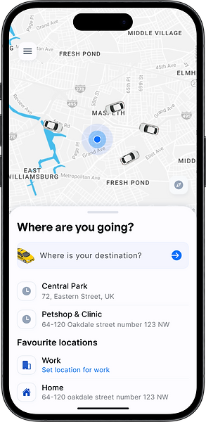
Recent destinations
favourite locations
Choose your route


Adding stop points

Choose your ride
Select a ride that fulfils your needs the best


Selecting travel preferences and viewing the cost of each one

Now just select your desired payment method...
And done! looking for a driver...


Showing alternative services with online drivers near the user's location are offered after a few seconds of waiting which can help user to start their trip faster by selecting other services.
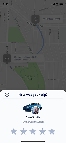
Enjoy your ride!


Other pages of the rider app

Responsive design
I used auto layout to create a seamless design for both desktop and mobile version

Stage 5 -Usability Testing After Redesign
After redesigning the application, I re-evaluated the new design that I had created. I tested 6 users who had participated in the first test using the same task scenario as in the first test. This test is carried out using a Figma prototype, and users are asked to run the prototype according to the task on their device. This test also wanted to see how the user’s expectations of the new design that I created, and find out whether the solution I implemented had addressed all the pain points that users felt in the first test before the redesign.
Testing Result
The results of the usability test of the new design got more positive results and feedback than the first usability test on the old design. All users could perform every task and got better results from the first usability test. That’s because I have implemented all the opportunities that came from user feedback in the first test to be applied to this new design. The average of each task got better results and is done faster in terms of time, especially on task 3 to contact support, because in the first test the task where the user had to contact with support was the task that the users complained the most and got an error result by 4 users in the first test. However, there are still some improvements that I have to make because there were new opportunities that could be developed further.
The table below is the result of the time and success of all the tasks that have been done by the users.

Conclusion
Overall, users have a pleasant experience after trying out the new design prototype. The problems that users complained about have also been resolved in this new design prototype. The new design makes setting pick-up and drop-off point faster, and easier. Faster to use because of the bold design of the set destination field on the homepage. Easier to use because users find it helpful to be able to to interact with the map right from the start in the homepage to set the pick-up point. Furthermore, rider felt visually and functionally happy by adding avatars as their profile pictures. The waiting time for a driver to be found is also more practical, which in this new design adds a description of the number of other available services with online drivers near the pickup point of the user.
Impact
Increase in registration completion rate by
38%
20% reduction in customer support inquiries
increase the usability of the product up to 50%
Closing
When I started this project, I aimed to address customer needs and frustration in the taxi booking experience of the Ridy application end users. Additionally, I wanted an opportunity to be ambitious and learn.
The complexity of designing natural and seamless user flows requires a great sense of empathy. As a result of this project, I became great listeners. I listened to commuters' needs, frustrations, their voices and their goals.
I designed experiences with them rather than designing experiences for them.

